2015 Home Color Trends

By Niki Cheng
Niki Cheng is co-owner of BoConcept New York with her husband Shaokao Cheng. They started BoConcept New York in 2003. With an architecture and interior design background, she has funished many homes in New York City. She is the proud mother of a 7-year old girl and 4-year old boy.
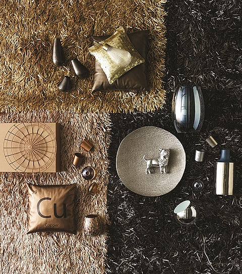
The Neutral Colors
The neutral colors are not just different shades of beige! Neutral colors featured in 2015 are weathered, rustic colors including a dusty gold and light tan. These shades are ideal for walls when paired with charcoal, grey and copper accents. Of course, beige is always in the picture for this look. Dark rustic brown leather is used a lot and is trendy regardless; it gives a sense of luxurious feel to the space. Play with copper accessories like lamps, center piece coffee table bowls and accent pillows.
The Deep Color Pallet
The deep color pallet includes serene and dreamy colors like teal, charcoal, and eggplant that are meant to evoke a mystical and sophisticated atmosphere while creating a sense of depth. In a living room, the colors help create a relaxing feel when mixed with richly patterned textiles and artwork pairing with white accessories. Painting walls in these colors can fool the eye into not knowing where the wall begins and ends, creating an illusion of more space. If you are decorating a room with one wall of windows, the dark wall color will frame and showcase the view outside your window.
The Glam Group
Cobalt blue, shiny black and super rich brown are the glam colors for the 2015 color trend. Cobalt blue is no stranger in the fashion and interior world, it has been around but this year designers are using it more than ever! When incorporating this dark rich blue with dark brown, beige and black, it gives a sense of luxurious feeling to the space. Whether you are designing a modern or vintage-inspired room, if you have wooden architectural elements or wooden furniture, they can look grand when set against a lashing cobalt blue. The result is trendy and elegant.
The Casual Crew
Avoid white, plain space and give way to energetic, eye-popping colors that help create a lively place for conversation—perfect for a dining room. Best used sparingly, you can balance out bright colors with neutral shades of gray on adjoining walls, trim, or the ceiling. These colors are also perfect for painting small decorative accessories for a pop of color on shelving displays. Radiant Orchid is another hot color to be used in 2015 for a vibrant pop of color! The trick with working with sunshiny-bright yellow is selecting upholstery and accessories to match the walls.
The Pretty Pastel Look
A lot of people mistake this look for a teenage girl's bedroom. The good thing about having this look is that no matter how many pastel colors you mix in the room, it will still look good but at BoConcept we like to use one pastel color on a large area balanced with white furniture. If you think pastel colors are too sweet, you can add zesty bright accents and dark touch of brown or black for extra dimension. You can also rock this look with any bright-colored accessories.
For more information:
boconcept.com/en-us/